Anatomy of Logo Design

Does your logo capture your brand story?
(If you don’t know what your brand story is, I suggest that you read our article about “Why you need a Branding Guide”
Your logo should immediately connect your clients to your brand. It is your story in graphic form and should evoke the emotions and thoughts that will make your potential clients want your product. Whether your brand is fun loving and casual, serious and trustworthy, or luxurious and expensive can all be communicated through your logo.
There are four main design elements in a logo, although not all logos incorporate every element:
- Icon
- Wordmark
- Color Palette
- Strapline
Icon - Unique and Distinctive
It’s not enough to say, “I’m an exterminator… So I should have a bug logo”, so get thee to the nearest clip art repository to find a cartoon bug – NO! A good logo icon will transform the unique elements of your brand story into graphic language that communicates the heart of that story to the world. It will be unique and recognizable as your own.
Wordmark – Legible, Memorable
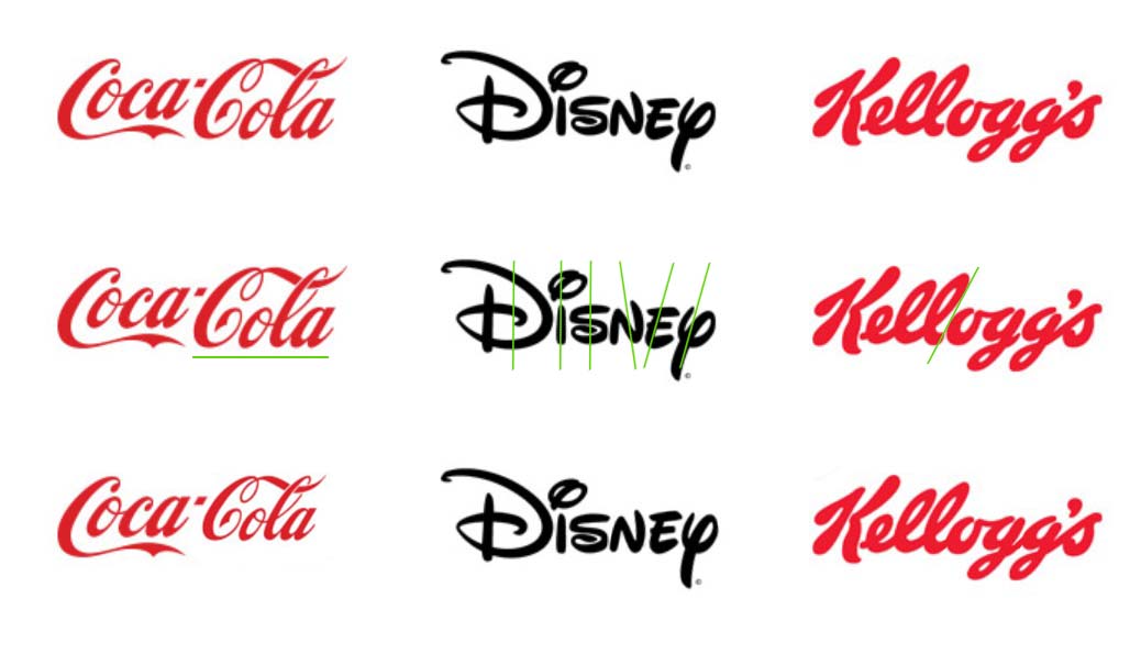
In general, your customer should immediately know your business name when seeing your logo wordmark. It should be recognizable, unique, and memorable. It should enable you to stand out from the crowd and should set the tone for your interactions with your clients. If your name is unusual, or a portmanteau that could be misinterpreted, the design of your wordmark should indicate the pronunciation or help interpret the word correctly. This can be done subtly with slight changes of font weight or stroke angle. We see more in words than we know. For example:

Notice how changing the relative sizing of Coca and Cola, the adjustment of stroke angle for the second syllable of Disney and the connection of the stroke between the syllables of Kellogg’s makes them harder to read. The fact that in the official logo, the Cola is slightly larger gives your brain the indication that this is more important, therefore the stress should be on the third syllable, not the first and third as would be more natural… cocaCOla, not COcaCola. Now these are some of the most well-known brands on the planet, but in the creation of their logos, careful thought was put into very small details of their logos.
Color Palette - It's not about YOU
A big part of designing a logo is choosing the right color palette. You should NOT select a color for your logo because you “like” it best or because it’s the color of your favorite football team. It’s hard to hear, but your LOGO is not about YOU. Sorry. Choosing your brand colors is about selecting the colors that will reveal the mood and intent of your brand story. Every color has a mood and makes you personally feel something, but there is a history of color usage in our society that gives us a background starting point in predicting how people in general will react to the use of particular shades and hues. Red means STOP and Green means GO are coded deep in our psyches as children and affect our responses on a subconscious level.
There is a wealth of information about color theory and design on the internet, much of it contradictory, but don’t worry. Your design team is going to be there to help you decide which set of colors is going to tell YOUR story.
Strapline or Tagline
Sometimes your logo can include a strapline or tagline that further informs the viewer about what you are offering. It can be a sub-branding if your business has multiple divisions that require their own marketing, a statement of purpose such as the famous Avis Rental car company’s “We Try Harder” campaign, or it can be used to describe what your business does if the name itself doesn’t explain it.
The tagline is a supporting feature and the choice of font, placement and color need to re-enforce the message of the logo as a whole.
Logo Variants
Your logo is going to do a lot of work. It may go on billboards 15 feet across, be used for packaging, labels, vehicle wraps, or be embroidered on a shirt. In today’s market, it also needs to fit into a square…. AND a circle for Facebook and Twitter, be shown at 18px across as the favicon of your webpage, look good on white, on black, watermarked over a photo… etc.

Obviously, most logos are not going to be well suited for all of these uses. That is why an important part of the modern logo design and branding process is to determine where your full official logo will be used, and where using a variant of your logo will represent your brand best. This goes beyond having a black and a white version of the logo. Your design team needs to consider the text and the details of your logo. At what point do you need to drop off the tagline and what does that do to the design? If your logo is long and horizontal or very tall and vertical, you probably need a square variant ready for Facebook. If your logo includes an icon, can that be separated from the rest of your logo for use in marketing without compromising your brand?
These are all questions that your design team needs to help you answer and provide you with official variants of your logo for use in the wide variety of circumstances that face the modern marketer.